旋转–rotate()
以中心为原点旋转,正值顺时针,负值逆时针
1
2
3
4
5
|
#test {
  transform:rotate(20deg);
  -webkit-transform: rotate(20deg);
  -moz-transform: rotate(20deg);
}
|
扭曲–skew()
不会旋转,只改变形状,如长方形变成平行四边形
1
2
3
4
5
|
#test {
  -webkit-transform: skew(45deg);
  -moz-transform: skew(45deg);
  transform:skew(45deg);
}
|
缩放–scale()
scale(x,y),水平与垂直方向,只有一个参数则倍数相同
1
2
3
4
5
6
|
#test:hover {
  opacity: .5;
  -webkit-transform: scale(0.8);
  -moz-transform: scale(0.8);
  transform: scale(0.8);
}
|
位移–translate()
translate(x,y),水平与垂直方向方向
1
2
3
4
5
|
#test {
  -webkit-transform:translate(-50%,-50%);
  -moz-transform:translate(-50%,-50%);
  transform:translate(-50%,-50%);
}/*水平垂直方向居中*/
|
矩阵–matrix(a,b,c,d,e,f)
含6个值的变换矩阵,用来指定一个2D变换,属性值涉及到数学中的矩阵知识
1
2
3
4
|
#test {
  -webkit-transform: matrix(1,0,0,1,100,100);
  transform: matrix(1,0,0,1,100,100);
}/*相当于translate(100px,100px);*/
|
设置元素中心点,取值(top,bottom,left,right,top left,top right,bottom right,bottom left),默认情况下旋转、扭曲等变形都是基于元素自己中心位置变形的,这个属性可以改变元素中心点
1
2
3
4
5
6
7
8
|
#test {
  -webkit-transform: skew(15deg);
  -moz-transform: skew(15deg);
  transform: skew(15deg);
  -webkit-transform-origin: top right;
  -moz-transform-origin: top right;
  transform-origin: top right;
}/*基于右上角扭曲15度*/
|
动画
过度属性–transtion
property 指定过度css属性duration 指定过度完成时间timing-function 指定过度函数delay 指定开始过度的延迟时间
 1
 2
 3
 4
 5
 6
 7
 8
 9
10
11
12
13
14
15
16
17
|
div {
width: 200px;
height: 200px;
background: green;
margin: 20px auto;
-webkit-transition-property: width;
transition-property: width;
-webkit-transition-duration:.5s;
transition-duration:.5s;
-webkit-transition-timing-function: ease-in;
transition-timing-function: ease-in;
-webkit-transition-delay: .18s;
transition-delay:.18s;
}/*等价于transtion(width,.5s,ease-in,.18s)*/
div:hover {
width: 400px;
}/*宽度由200变为400*/
|
多个属性需要过渡时,用逗号隔开如下
1
|
a{ transition: background 0.8s ease-in 0.3,color 0.6s ease-out 0.3;}
|
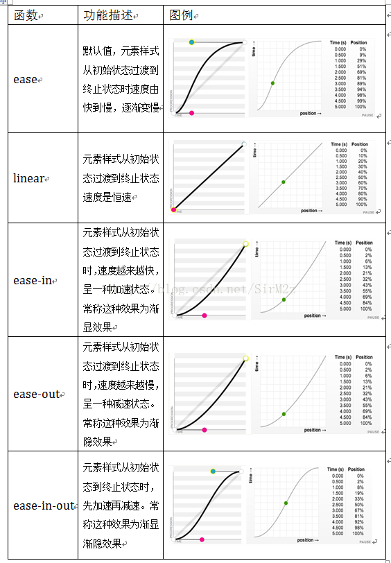
timing-function(过度函数):ease,linear,ease-in,ease-out,ease-in-out,具体如下图
关键帧–keyframes
后紧跟动画名加一对花括号{},0%->100%可以用from->to表示
 1
 2
 3
 4
 5
 6
 7
 8
 9
10
11
12
13
14
15
16
17
18
19
20
21
22
23
24
|
@keyframes changecolor{
  0%{
    background: red;
  }
  40%{
    background:orange;
  }
  80%{
    background:green;
  }
  100%{
    background: red;
  }
}
div {
  width: 300px;
  height: 200px;
  background: red;
  color:#fff;
  margin: 20px auto;
}
div:hover {
  animation: changecolor 5s ease-out .2s;
}
|
动画–animation
分别有如下几个属性,其中timing-function与过渡中的timing-function有一样的方法
1
2
3
4
5
6
7
8
|
animation-name:around;/*动画名*/
animation-duration: 10s;/*动画在这个时间段内完成*/
animation-timing-function: ease;/*动画播放方式*/
animation-delay: 1s;/*动画延迟,在这个时间段后开始*/
animation-iteration-count:infinite;/*动画播放次数,通常为整数,此处意思是无限播放*/
animation-direction:alternate;/*normal是默认值,如果设置为normal时,动画的每次循环都是向前播放;此处是alternate,他的作用是,动画播放在第偶数次向前播放,第奇数次向反方向播放。*/
animation-play-state:running;/*这个属性应该设在hover下,元素本身的属性设置为paused;意思是让停止的动画在hover的时候播放,不是hover状态停止*/
animation-fill-mode:none;/*设置动画时间外属性,详情如下表*/
|
animation-fill-mode
| 属性值 |
效果 |
| none |
默认值,表示动画将按预期进行和结束,在动画完成最后一帧时,动画会反转到初始帧处 |
| forwards |
表示动画在结束后继续应用最后的关键帧的位置 |
| backwards |
会在向元素应用动画样式时迅速应用动画的初始帧 |
| both |
元素动画同时具有forwards和backwards效果 |